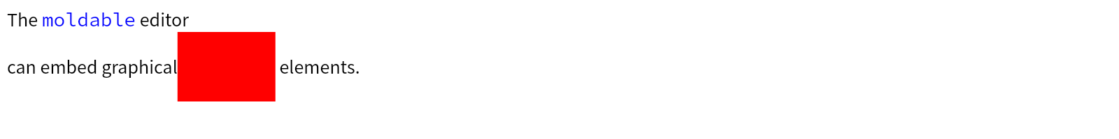
Building a custom button appearance
Button is one of the most essential graphical components in UI. It can be in a lot of different variaties and forms.
See BrButtonModel
for a more detailed description.
A button widget is an instance of BrButton
. By default it does not have any attached look and therefore has no visual appearance:
newButton
	<gtExample>
	<return: #BrButton>
	^ BrButton new
Behavior
A button widget is composed of multiple view models that add important functionality:
BrLabelModel
is responsible for button's label
BrIconModel
adds support of an icon
BrInteractiveModel
lets users to enable or disable a button (make it non-interactable)
BrPressModel
provides support of handling press state
BrHoverModel
adds support of mouse hover events
BrSizeAdjustmentModel
is responsible for managing the logical size of a button (tiny, small, large etc)
BrLayoutHorizontalResizerModel
provides support for horizontal resizing strategies (fit content, match parent, exact size)
BrLayoutVerticalResizerModel
is similar to horizontal resizer but controls a vertical resizing strategy
Button's look can be implemented by composing existing looks or implementing a new one.
Having BrLabelModel
view model is not enough to create a button with a label. For that we would need to add BrTextLabelAptitude
:
buttonWithLabelLook
	<gtExample>
	<return: #BrButton>
	| aLabelLook |
	aLabelLook := BrTextLabelAptitude new.

	^ self newButton aptitude: aLabelLook
Of course, a text style can be customized to match user's preference:
buttonWithLabelLookAndCustomFont
	<gtExample>
	<return: #BrButton>
	| aLabelLook |
	aLabelLook := BrTextLabelAptitude new.
	aLabelLook
		bold;
		fontName: 'Source Sans Pro';
		fontSize: 20;
		foreground: Color gray.

	^ self newButton aptitude: aLabelLook
Quite often though, it may be needed to change label's style when users hover a button. BrHoverModel
handles widget hover state change. To style the text accordingly we can add BrInteractiveCommonAptitude
to the previosly created BrTextLabelAptitude
. Please note that we should also provide default values for all button properties that change due to interactivity in a default: style:
buttonWithLabelLookReactingToHover
	<gtExample>
	<return: #BrButton>
	| aLabelLook |
	aLabelLook := BrTextLabelAptitude new.
	aLabelLook
		bold;
		fontName: 'Source Sans Pro';
		fontSize: 20.

	aLabelLook
		add: (BrInteractiveCommonAptitude new
				default: [ aLabelLook foreground: Color gray ];
				hovered: [ aLabelLook foreground: Color darkGray ]).

	^ self newButton aptitude: aLabelLook
In a similar fashing we can also change the text style on a button press which is managed by BrPressModel
:
buttonWithLabelLookReactingToHoverAndPress
	<gtExample>
	<return: #BrButton>
	| aLabelLook |
	aLabelLook := BrTextLabelAptitude new.
	aLabelLook
		bold;
		fontName: 'Source Sans Pro';
		fontSize: 20.

	aLabelLook
		add: (BrInteractiveCommonAptitude new
				default: [ aLabelLook foreground: Color gray ];
				hovered: [ aLabelLook foreground: Color darkGray ];
				pressed: [ aLabelLook foreground: Color black ]).

	^ self newButton aptitude: aLabelLook

One more common use-case is to provide a text style for a disabled button which is modelled by BrInteractiveModel
. Please note that disabled button does not react to click and hover events:
buttonWithLabelLookReactingToHoverAndPressAndDisabled
	<gtExample>
	<return: #BrButton>
	| aLabelLook |
	aLabelLook := BrGlamorousLabelAptitude new.
	aLabelLook
		bold;
		fontName: 'Source Sans Pro';
		fontSize: 20.

	aLabelLook
		add: (BrStyleCommonAptitude new
				@ aLabelLook label;
				default: [ :aStyle | aStyle foreground: Color gray ];
				hovered: [ :aStyle | aStyle foreground: Color darkGray ];
				pressed: [ :aStyle | aStyle  foreground: Color black ];
				disabled: [ :aStyle | aStyle  foreground: Color veryLightGray ]).

	^ self newButton
		disable;
		aptitude: aLabelLook

Sometimes users may want to create a look that depends on a logical button size modelled by BrSizeAdjustmentModel
. For example a button can be made huge beHuge or tiny beTiny. To style a label based on the logical widget size we can use BrSizeAdjustmentAptitude
which provides a fluent api for variuos sizes. Click on the label to randomly change its logial size:
buttonWithLabelLookOfDifferentSizes
	<gtExample>
	<return: #BrButton>
	| aLabelLook |
	aLabelLook := BrTextLabelAptitude new.
	aLabelLook
		bold;
		fontName: 'Source Sans Pro'.

	aLabelLook
		add: (BrDeprecatedSizeAdjustmentAptitude new
				default: [ aLabelLook fontSize: 20 ];
				tiny: [ aLabelLook fontSize: 10 ];
				small: [ aLabelLook fontSize: 16 ];
				large: [ aLabelLook fontSize: 26 ];
				huge: [ aLabelLook fontSize: 36 ]).

	^ self newButton
		action: [ :aButton |
			aButton
				perform: #(beNormalSize beTinySize beSmallSize beLargeSize beHugeSize) atRandom ];
		beSmallSize;
		aptitude: aLabelLook
Now lets put together the final label look that we will use later to build our custom button:
labelLookWithCommonAndSizeInteractions
	<gtExample>
	<return: #BrTextLabelAptitude>
	| aLabelLook |
	aLabelLook := BrTextLabelAptitude new.
	aLabelLook
		bold;
		fontName: 'Source Sans Pro'.

	aLabelLook
		add: (BrInteractiveCommonAptitude new
				default: [ aLabelLook foreground: Color gray ];
				hovered: [ aLabelLook foreground: Color darkGray ];
				pressed: [ aLabelLook foreground: Color black ];
				disabled: [ aLabelLook foreground: Color veryLightGray ]).

	aLabelLook
		add: (BrDeprecatedSizeAdjustmentAptitude new
				default: [ aLabelLook fontSize: 20 ];
				tiny: [ aLabelLook fontSize: 10 ];
				small: [ aLabelLook fontSize: 16 ];
				large: [ aLabelLook fontSize: 26 ];
				huge: [ aLabelLook fontSize: 36 ]).

	^ aLabelLook
...